Attracting immigrant professionals as customers
July 2021
Working in Agile, our team of 10 students at Academy Xi successfully researched, ideated and concept-tested ways to increase new-to-bank and long term customers of Westpac.
Going beyond the initial brief, we also designed and usability-tested additional features for inclusion in the Westpac mobile app.
Westpac is one of Australia's 'big four' banks, with branches across the country and Asia Pacific region.
The brief
The brief asked us to consider ways in which the bank could not only attract new customers, but also find ways to retain them over the long term. With COVID closing Australia's borders, the bank wanted to understand how to attract more immigrant professionals once the country re-opened.
In terms of deliverables, we were asked to deliver personas, future state journey maps and concept-tested solutions.
The problem
Initially it was unclear what problem the bank was trying to solve; we decided to frame the problem from the customer's perspective in a way that would also meet the bank's brief.
We felt it was important to help customers at the same time as helping the bank.
The challenge for this project was that the bank wanted a top-down view of commonalities across all cultural groups, rather than niching down to focus on one or two. This was a challenge as the usual human centred design approach requires higher levels of specificity, for example when building personas. If they are too broad, the solution or product won't be targeted at the right user.
Regardless, we developed a preliminary problem statement based on what we knew so far:
Research approach
Following divergent thinking we delved into research to understand settlement flows into Australia, attitudes toward banking among different cultures and drivers for selecting one bank over another, among other themes.
Our research revealed that a number of immigrants come to Australia as students with the aim of staying for the long term, and are often drawn here by work opportunities and lifestyle factors.
Interestingly, we found that many people are still arriving during the COVID period, despite the 'closed borders.' This was a real opportunity point for Westpac, as this finding meant they didn't need to wait for borders to re-open to start targeting this cohort of customers.
Key insights
Empathising with our users
From the desktop research and interviews we now had a rich source of qualitative and quantitative data from which to pull together our personas.
As mentioned above, the client directed us to avoid focusing on the experience of one or two cultural or ethnic groups, so we had to find experiences common to all. While this helped reveal the bigger themes for Westpac, it was a challenge to create such broad personas.
Our solution was to combine the common ground but still narrow down the ethnic and cultural backgrounds of our customers. This approach informed our empathy mapping, personas and customer journeys.
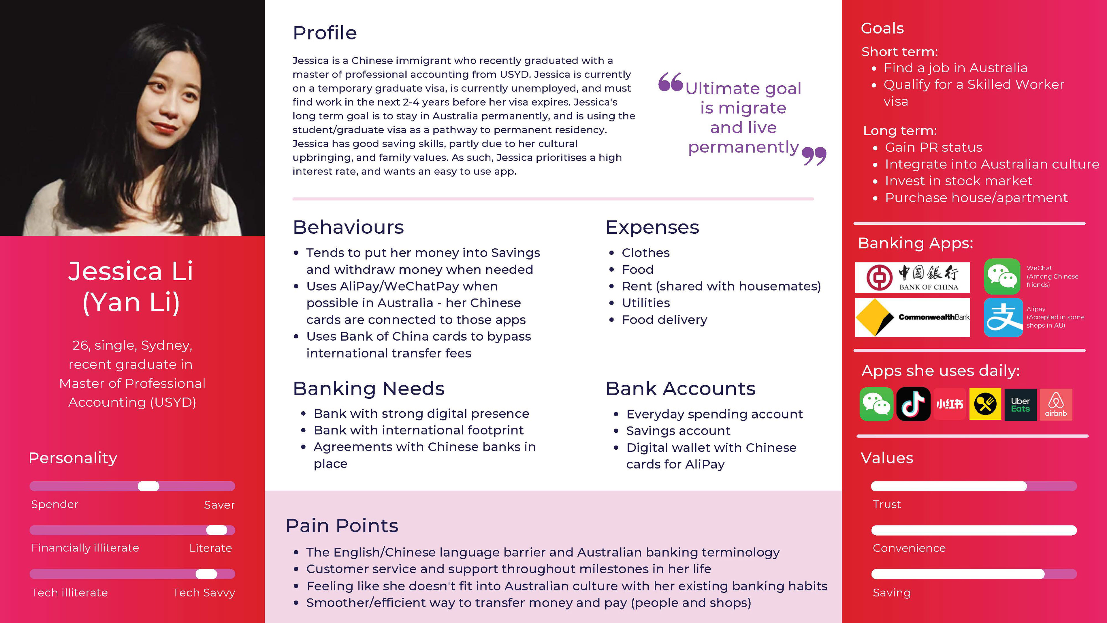
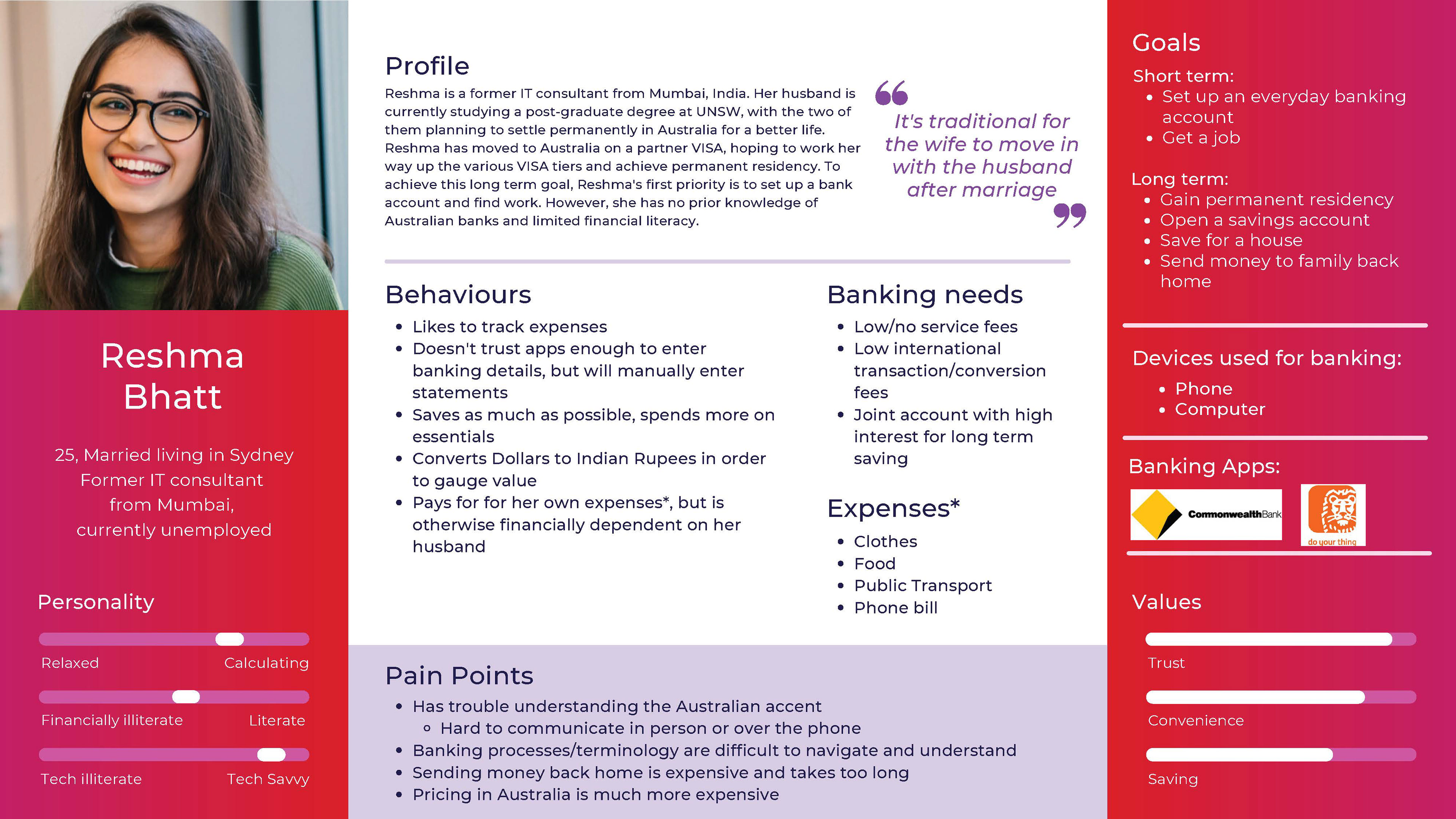
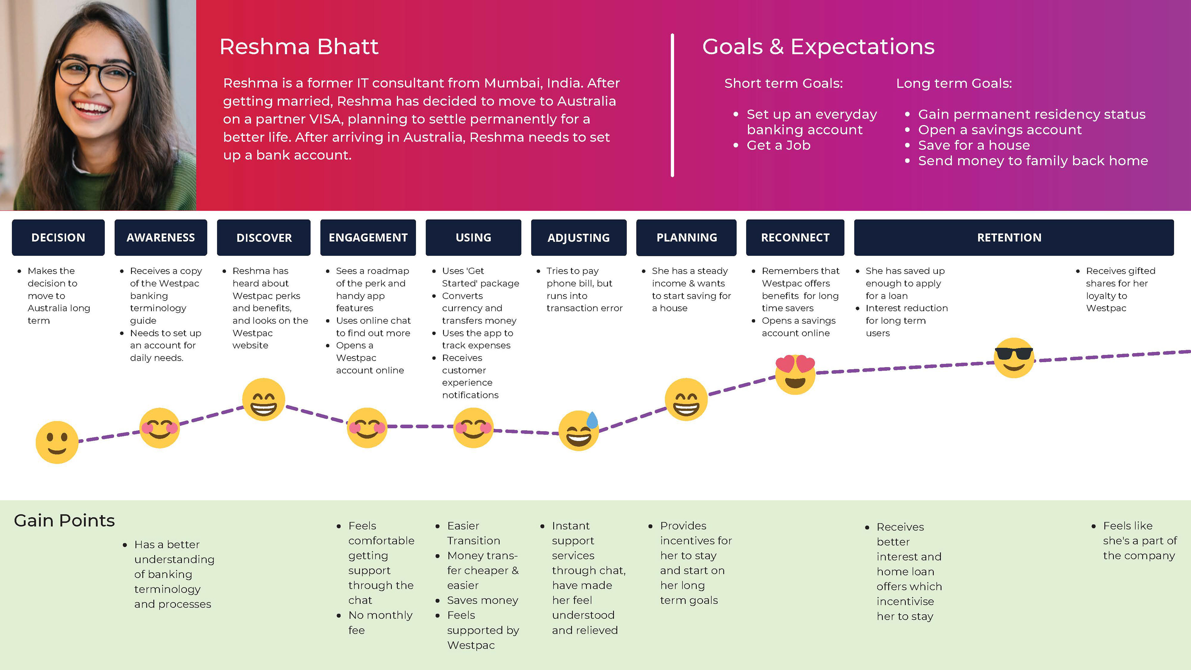
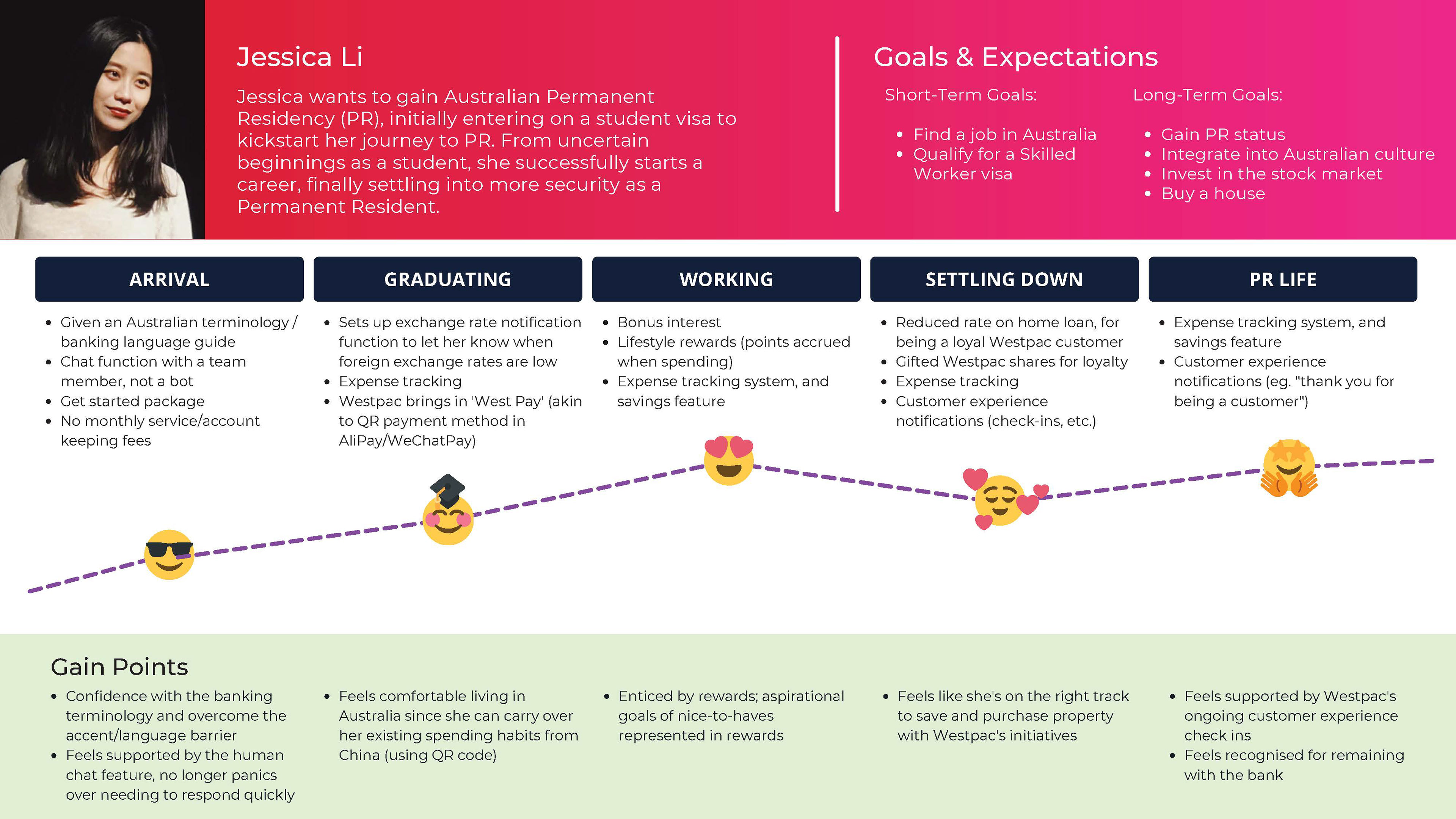
We weren't going to budge on being specific about our personas' ethnic background. Our two users represent the top two immigrant groups to Australia by country of birth: China and India, in alignment with our research insights.
Meet Jessica and Reshma
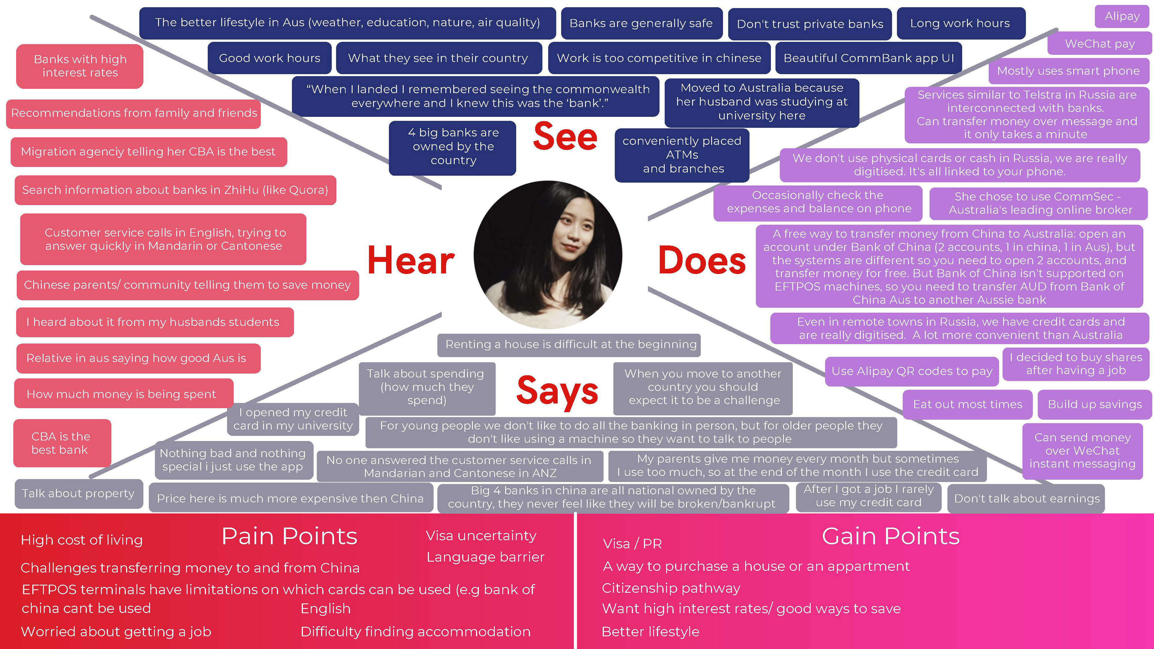
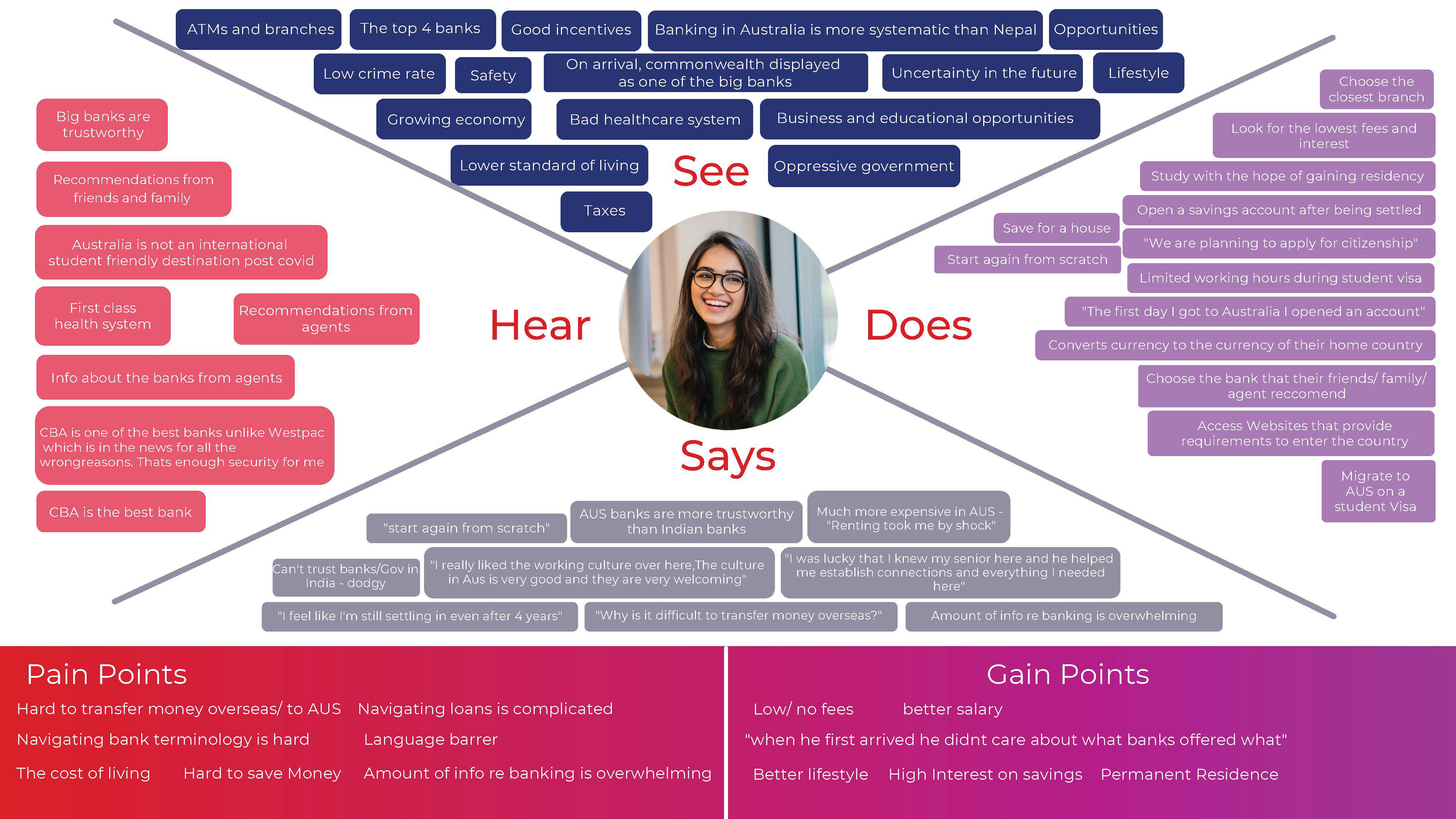
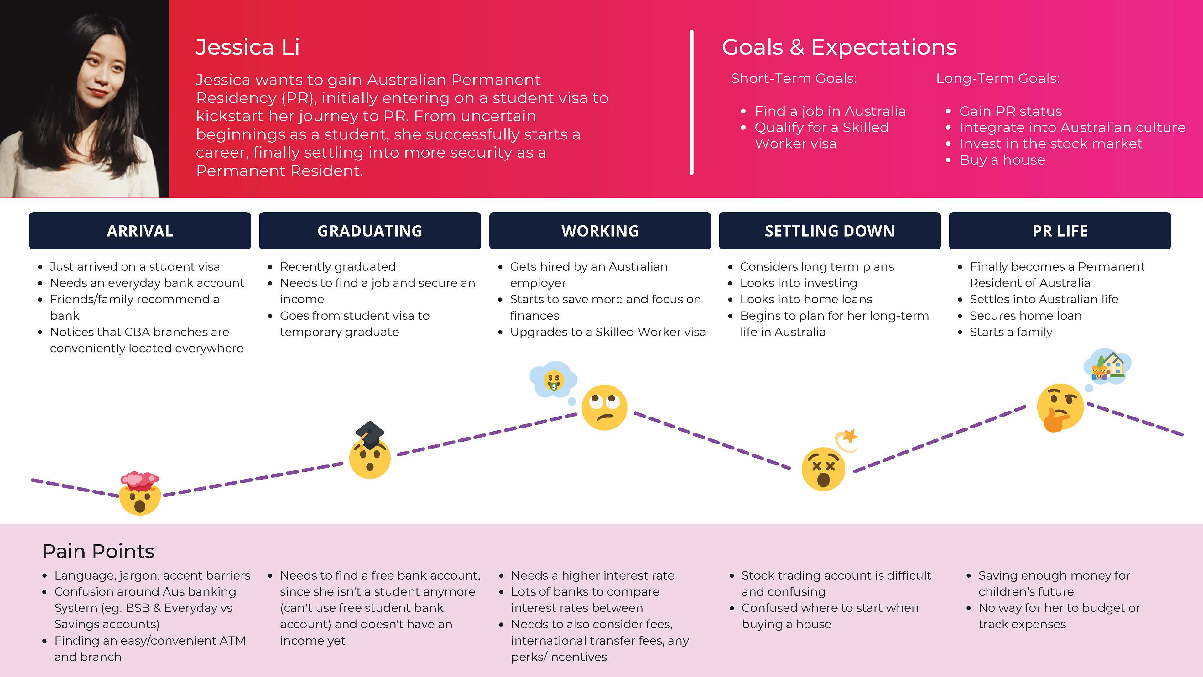
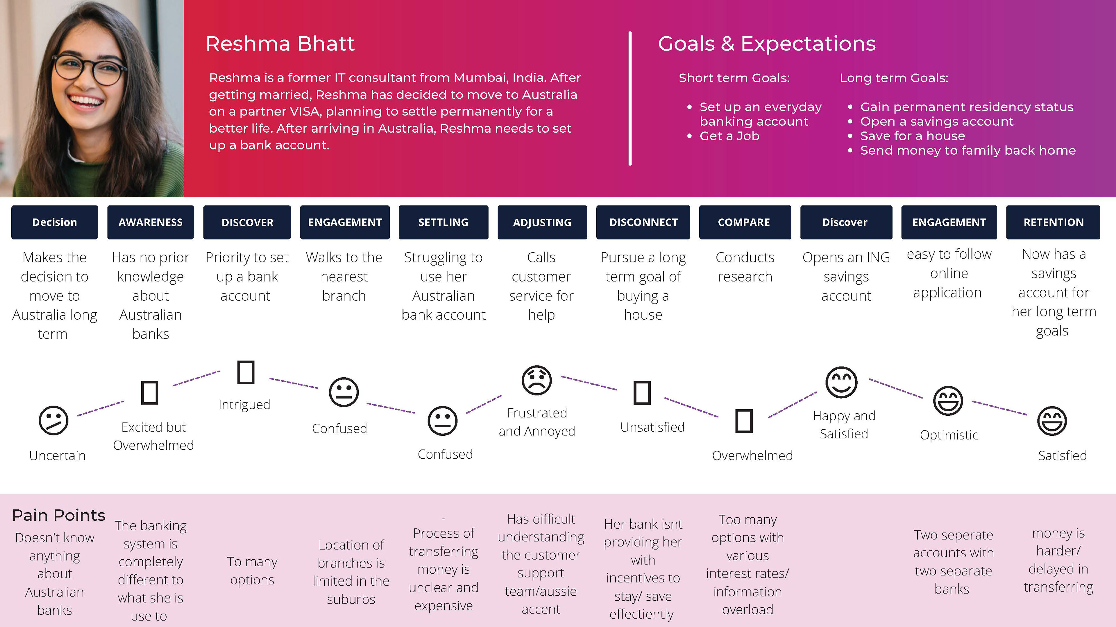
Candid insights: the immigrant banking journey
Thanks to our team's diversity, we were able to gather candid insights about banking and the immigrant experience, grounding our personas and their journey in lived reality.
The artefacts above illustrate how immigrants generally arrive in Australia as graduate students or sponsored workers, and generally plan to stay here for the long term. They quickly leave their student life behind, moving into professional roles on their journey toward permanent residency and citizenship.
These journeys validated the client's strategy communicated in the brief: young immigrant professionals represent a real opportunity both as new-to-bank and long term customers.
Develop: ideation and concept testing
With the clarity of our personas and customer journeys, we understood Jessica and Reshma's pain points: they struggled to navigate Australian banking terminology; couldn't easily transfer money from overseas; and didn't see many incentives to staying with Westpac over the long term, among other challenges.
We developed our "how might we" statements to focus our brainstorming in a group ideation workshop conducted via Zoom.
In this call we included not only our group but also some research participants who were able to offer ideas about improving banking for immigrants.
We conducted 'crazy sixes' (due to time constraints), voted on the top ideas, grouped them into insights and further refined them.
Grouping ideas according to the brief
With our refined ideas, we grouped them into three phases: initial customer engagement, ongoing benefits and long term benefits.
These three phases represented potential solutions that we hypothesised would capture new customers, and also offer enough of an incentive to keep customers over the long term.
As a value add to the client (and ensuring we had their permission to spend time on this), we added an extra category of ideas from our workshop that offered improvements to the existing Westpac banking app (as the research had revealed a number of opportunity areas).
From here, our group split into concept testing and building out user flows and high fidelity prototypes of the Westpac app features. The prototyping aspect was a valuable experience in working within Westpac's Global Experience Library (GEL) and design system, while also refining my Figma skills.
Concept testing
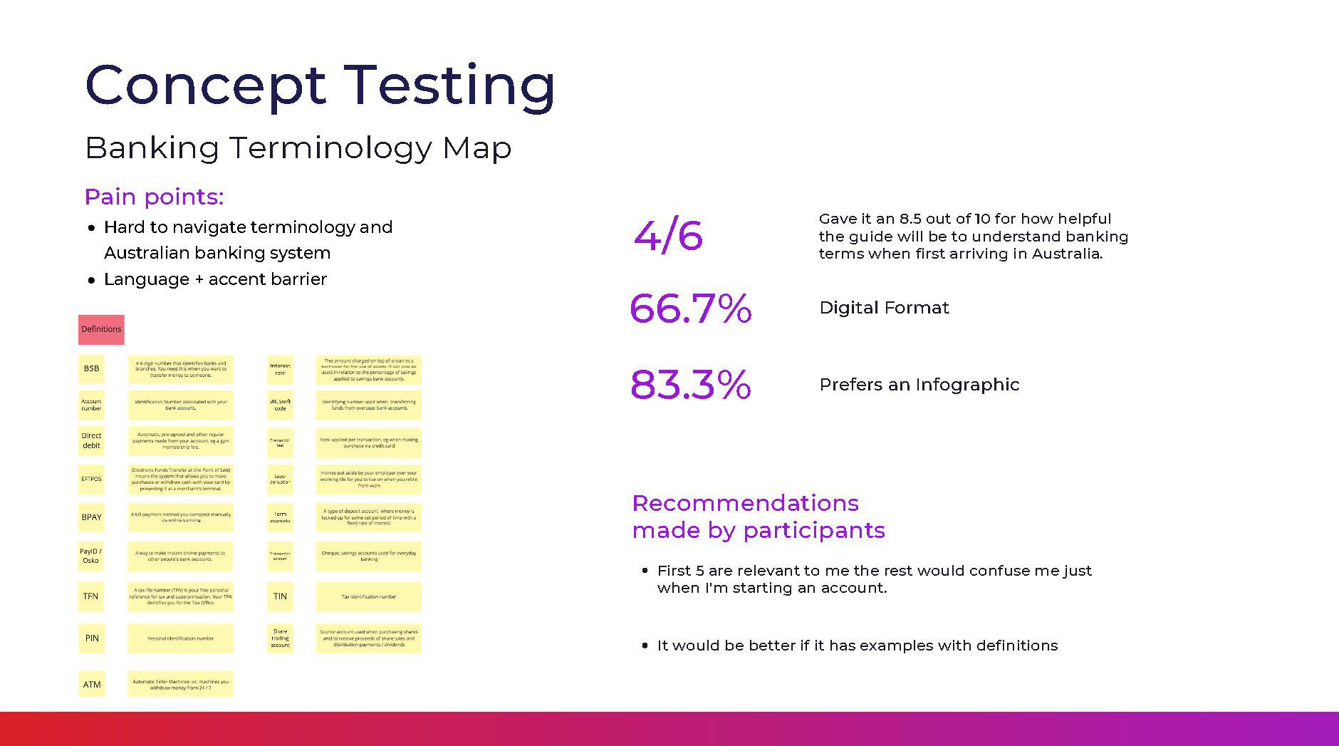
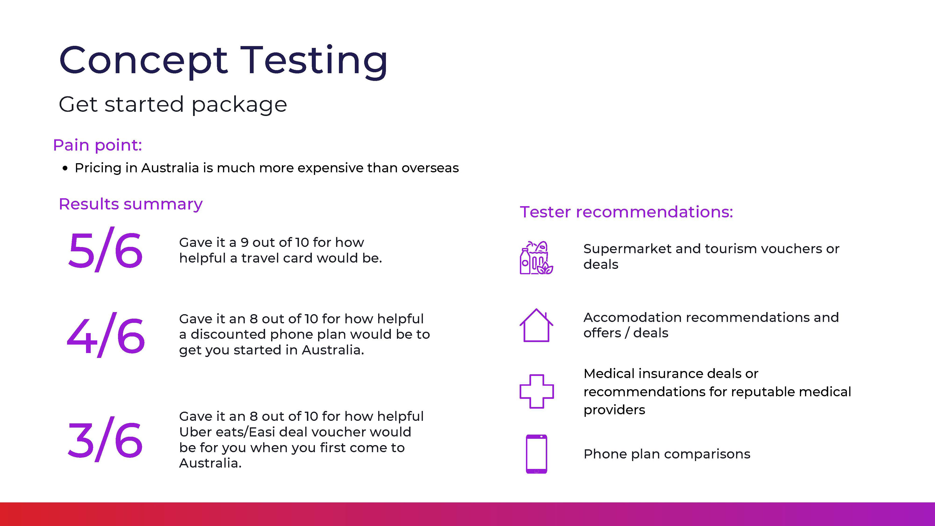
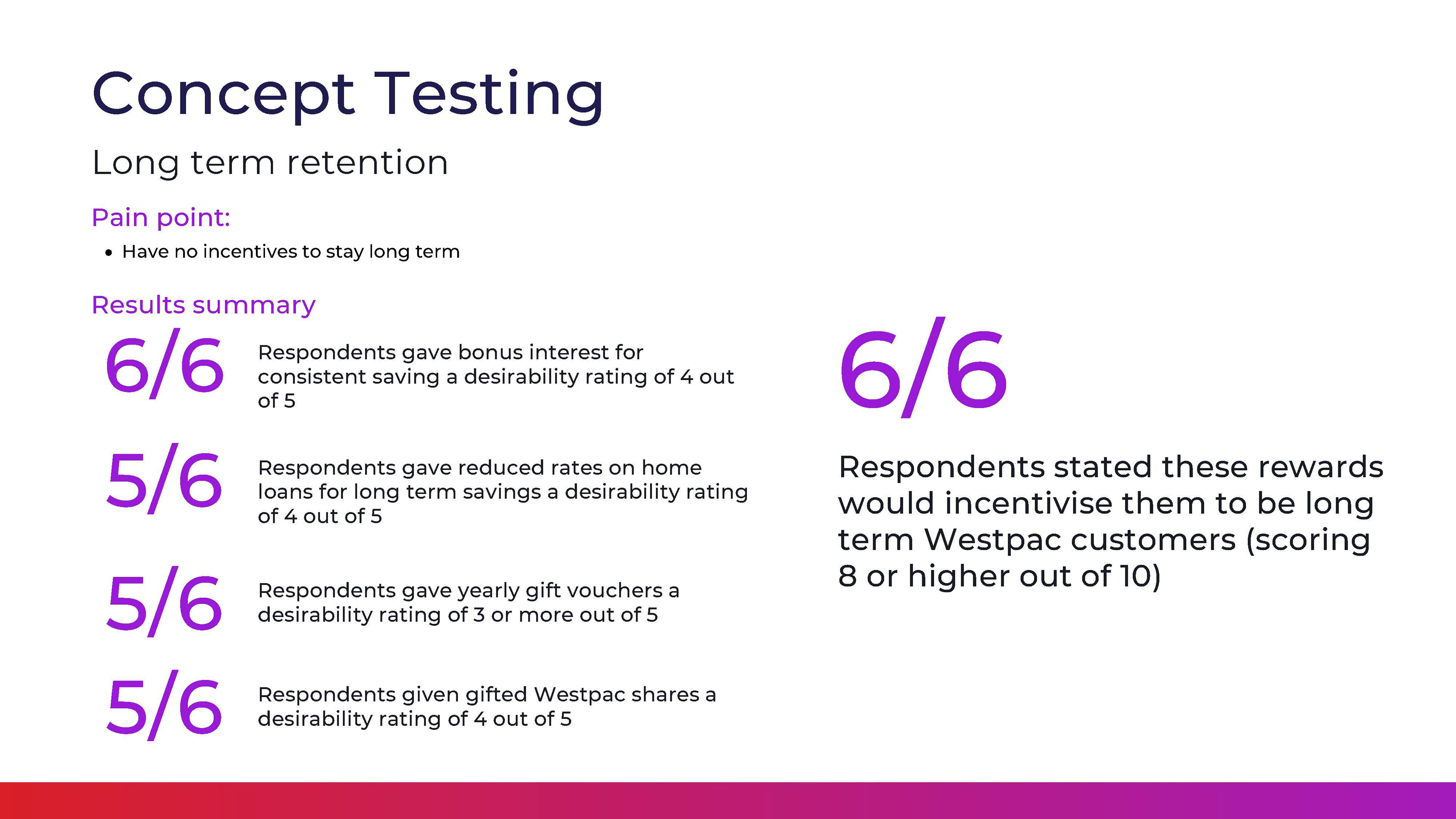
Reaching out to six "Jessicas" and "Reshmas", our group validated the above ideas. We found that our hypotheses around initial engagement and ongoing/long term retention were generally validated. The majority of our respondents scored each idea highly in a rating out of 10, shown in the slides below.
Prototyping
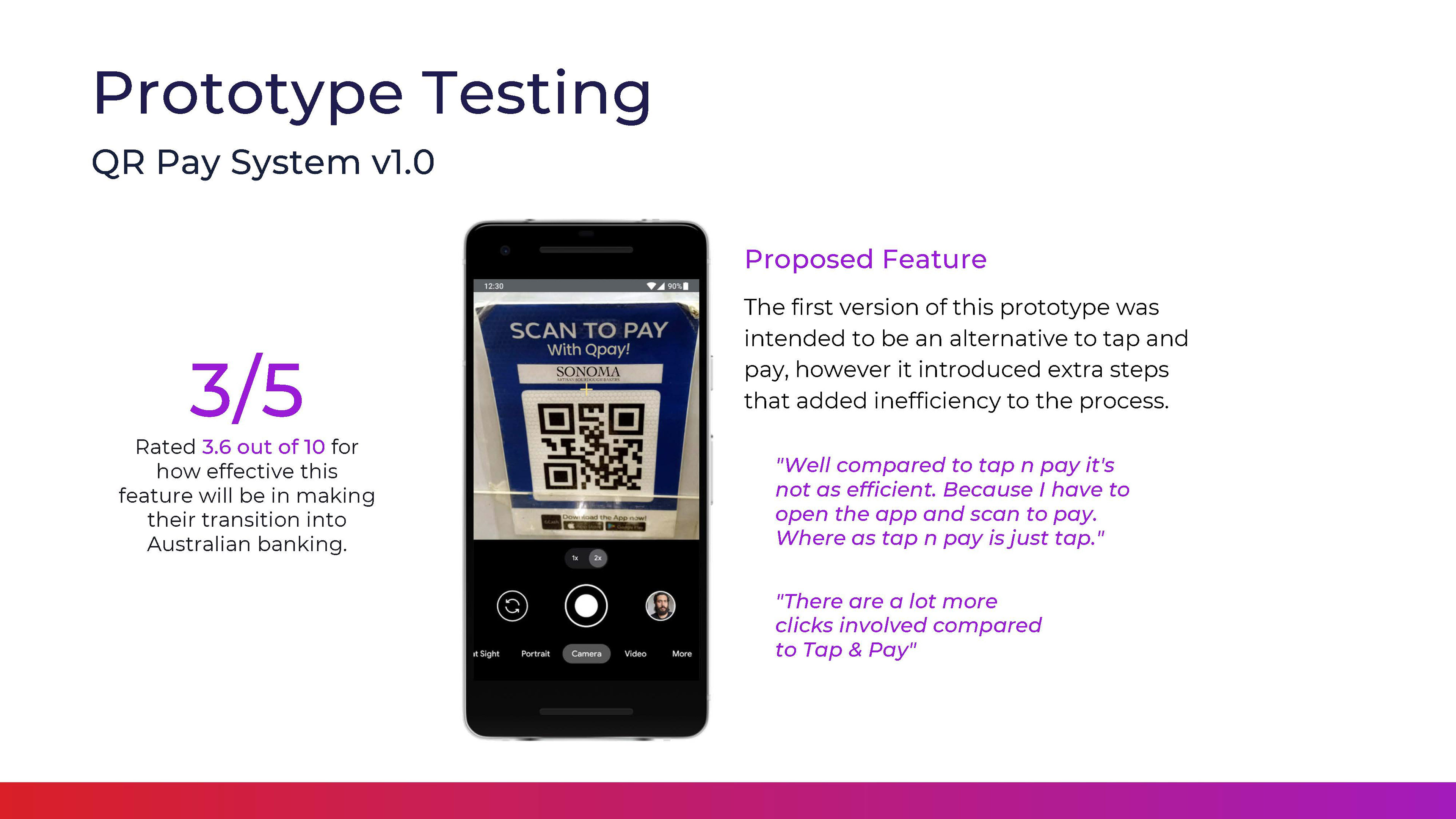
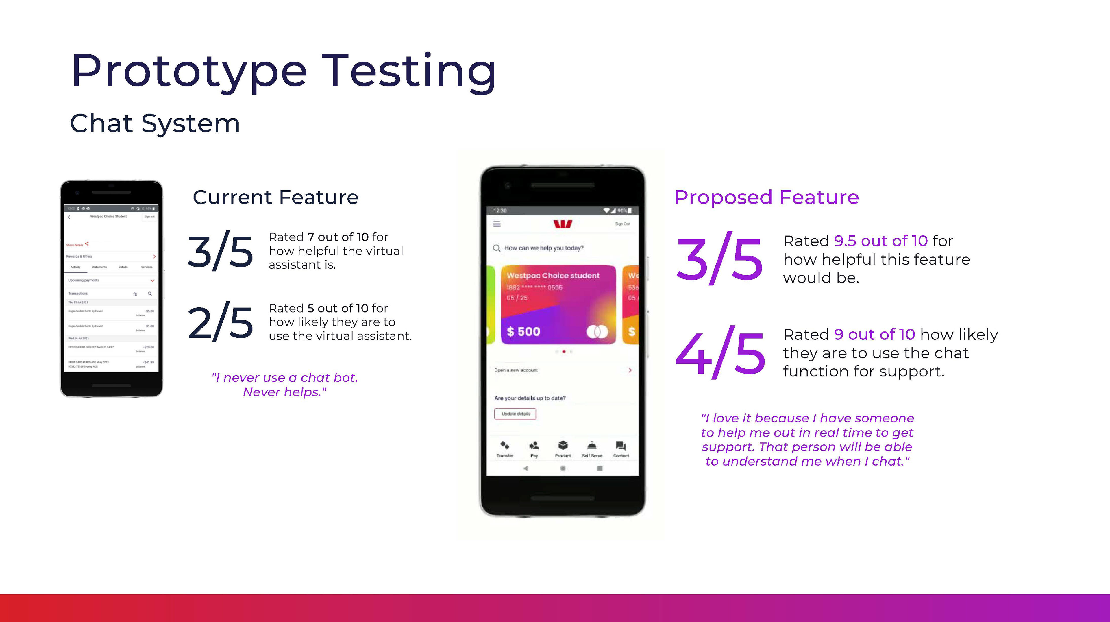
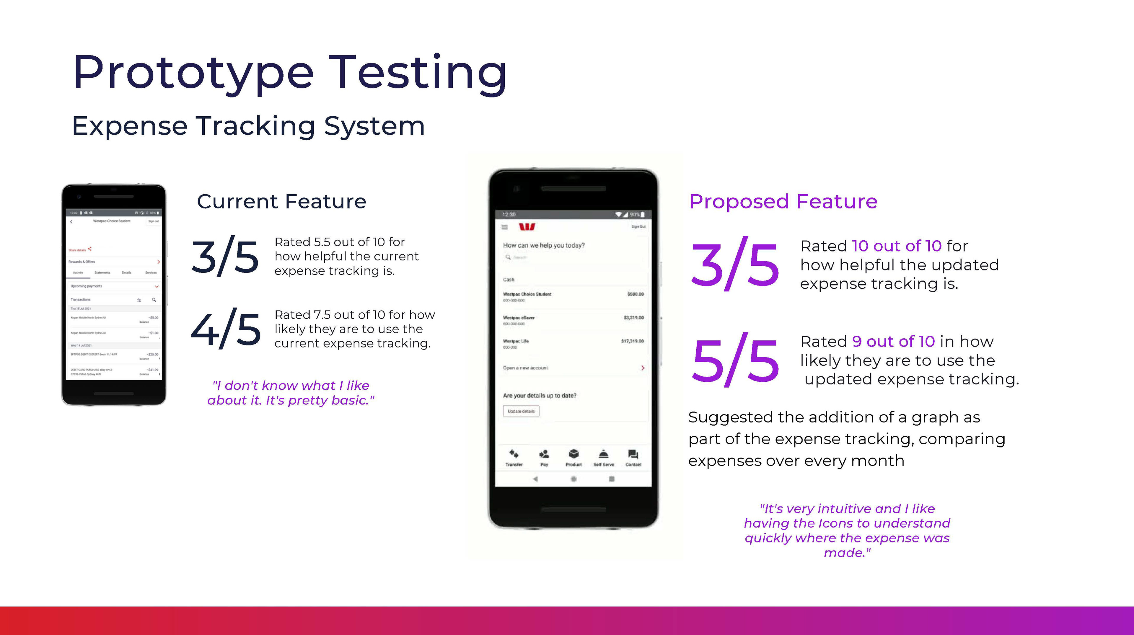
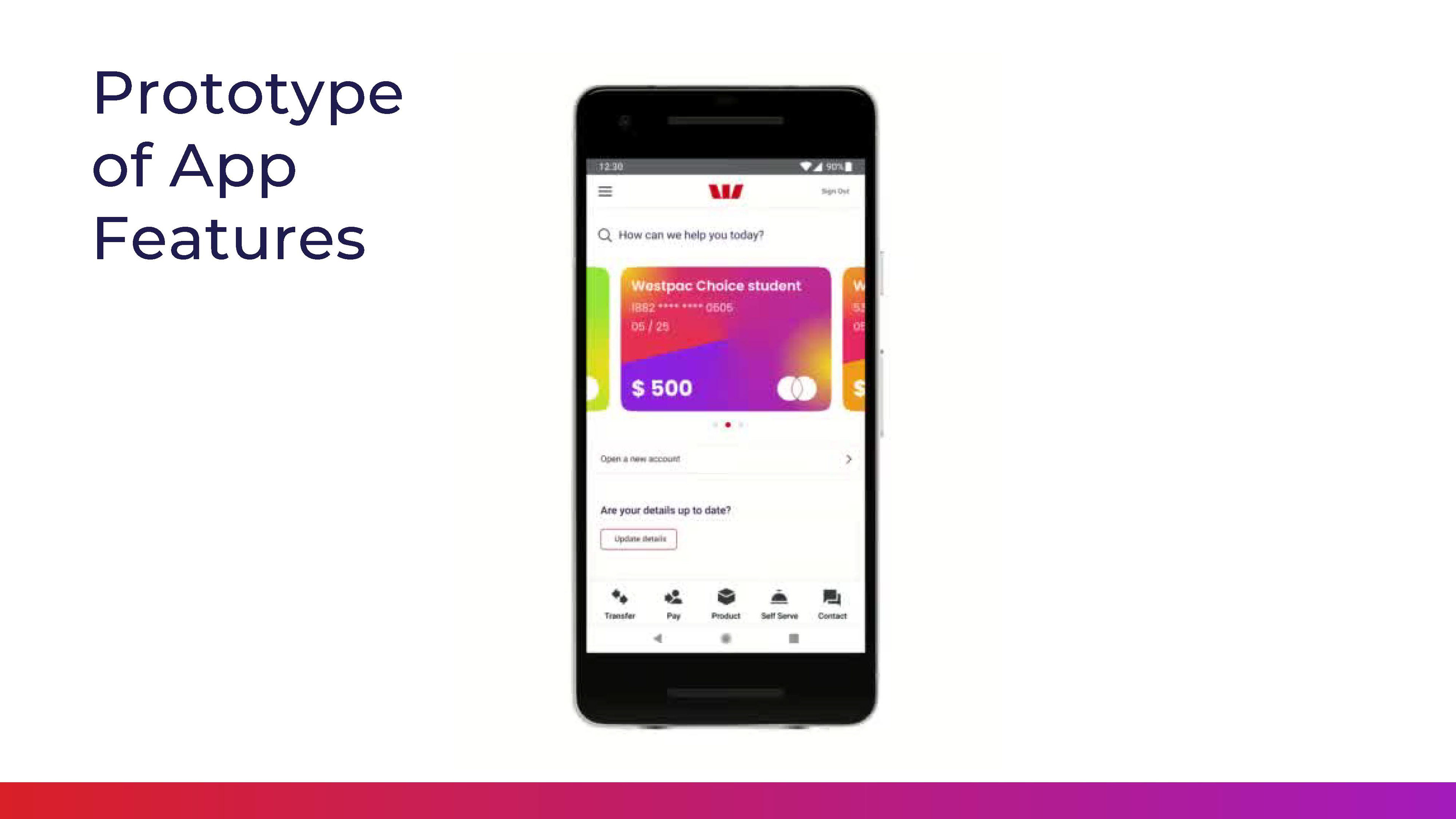
Splitting into smaller groups, we built out flows and a hi-fi prototype of three features as our focus, based on our research: improving the transaction list, chat function and adding a new QR pay functionality.
Usability testing and iteration
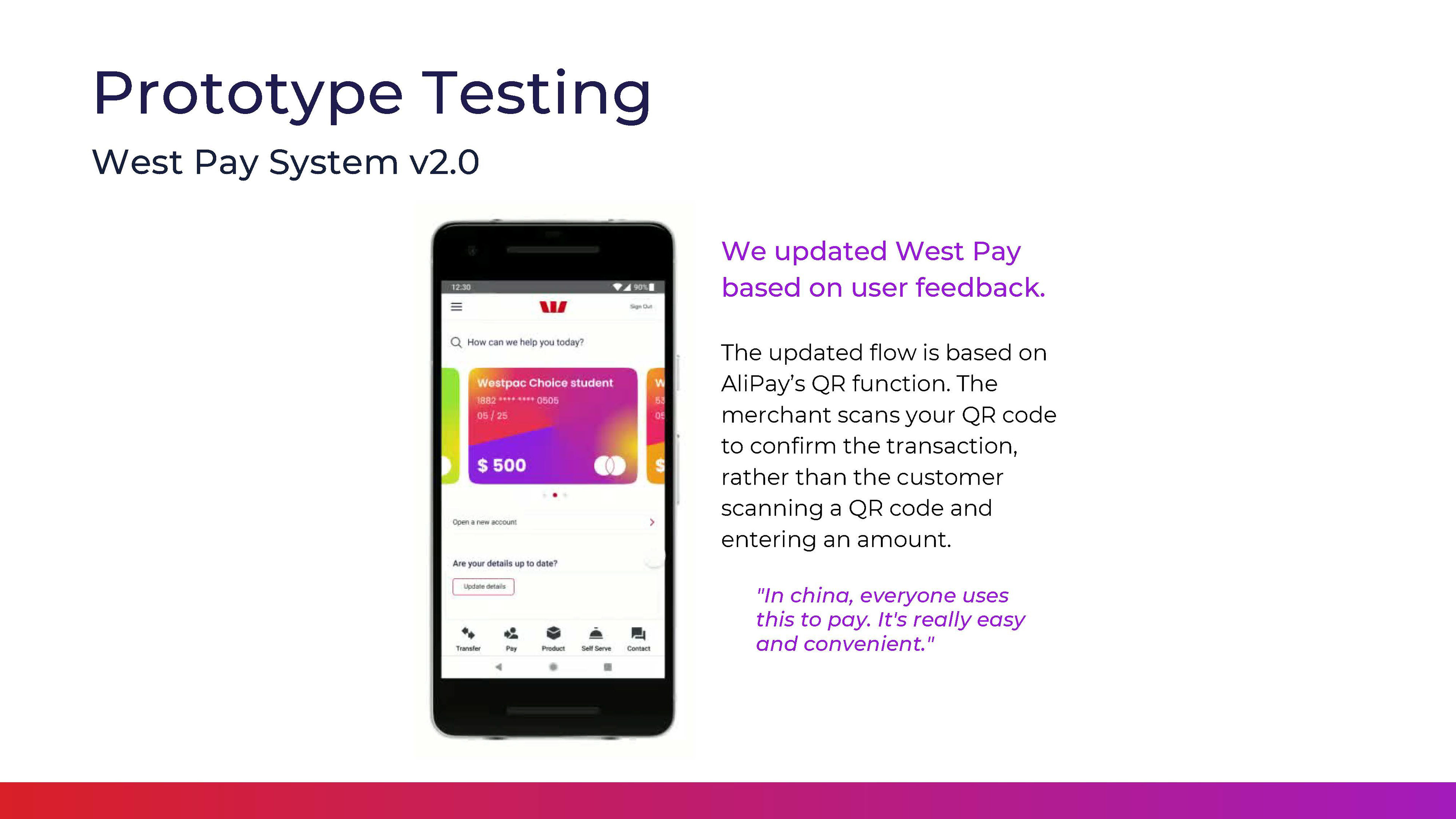
Our proposed new functions yielded mixed results. While the new transaction list and chat function was found to be helpful and "intuitive" by our Jessicas and Reshmas, the QR pay function added more steps and was less efficient.
We iterated the design to simplify the QR code payment system to make it more efficient with fewer screens.
Future state journey maps
While the app features were a value add, future state journey maps were a required deliverable in the brief.
Following concept testing, we revisited our original customer journey maps, adding in "gain points" that would impact their emotional state at each phase. These gain points were our solutions that we devised in ideation and tested.
As a result of the generally positive feedback on both concept and usability testing, we were confident that Jessica and Reshma felt more supported by the solutions. This resulted in future state journeys which, should all our ideas be implemented, would lead to a more positive experience overall.
Next steps: limitations and opportunities
As a result of COVID-19 restrictions in place at the time of this project, we were limited in reaching out to customers on the ground and conducting guerrilla research. This may have provided access to professional migrants in situ at physical branches.
We were limited by a two week sprint to achieve this work - while we achieved a lot in that time, with more resources and time, we may have been able to attain more clarity or conducted paid research.
Value for the client
In two weeks, my team of students uncovered valuable insights into immigrants' journeys to Australia; their perceptions of Australian banks and Westpac specifically; and also ideated, tested and iterated solutions to meet the brief. Not only that, we designed and tested high fidelity prototypes of features for the Westpac banking app.
Personally, my corporate experience contributed to continually guiding my team members to follow the brief; ensuring flows of communication; delivering a greater depth of research and building out user flows and Figma prototype screens.
