Customer advocacy and content design
July 2020 - January 2021
Content design, research and user advocacy: communicating a complex business transaction to a diverse customer base.
Bringing two companies together...simple, right?
Sounds great in theory. But when there's an army of lawyers involved, it gets complicated. Here's an overview of the project, from a legal perspective:
CommInsure, part of Commonwealth Bank of Australia (CBA), was originally going to be acquired by AIA Australia by way of a share sale.
However, due to delays from overseas regulators, an alternative to the share sale pathway was chosen: a transfer of CommInsure's life insurance business to AIA Australia under Part 9 of the Life Insurance Act 1995.
Oof. Not so simple to communicate!
The core challenge in this design journey was language. In other words (mind the pun) we had to explain a complex regulatory process (aka the transfer) in a way that made sense to customers, while still meeting legal requirements mandated by the Federal Court, which would be the final approver of the transfer, and therefore the acquisition as a whole.
My role
I was brought on board as a project copywriter to write and manage communications regarding the acquisition of CommInsure's life insurance business.
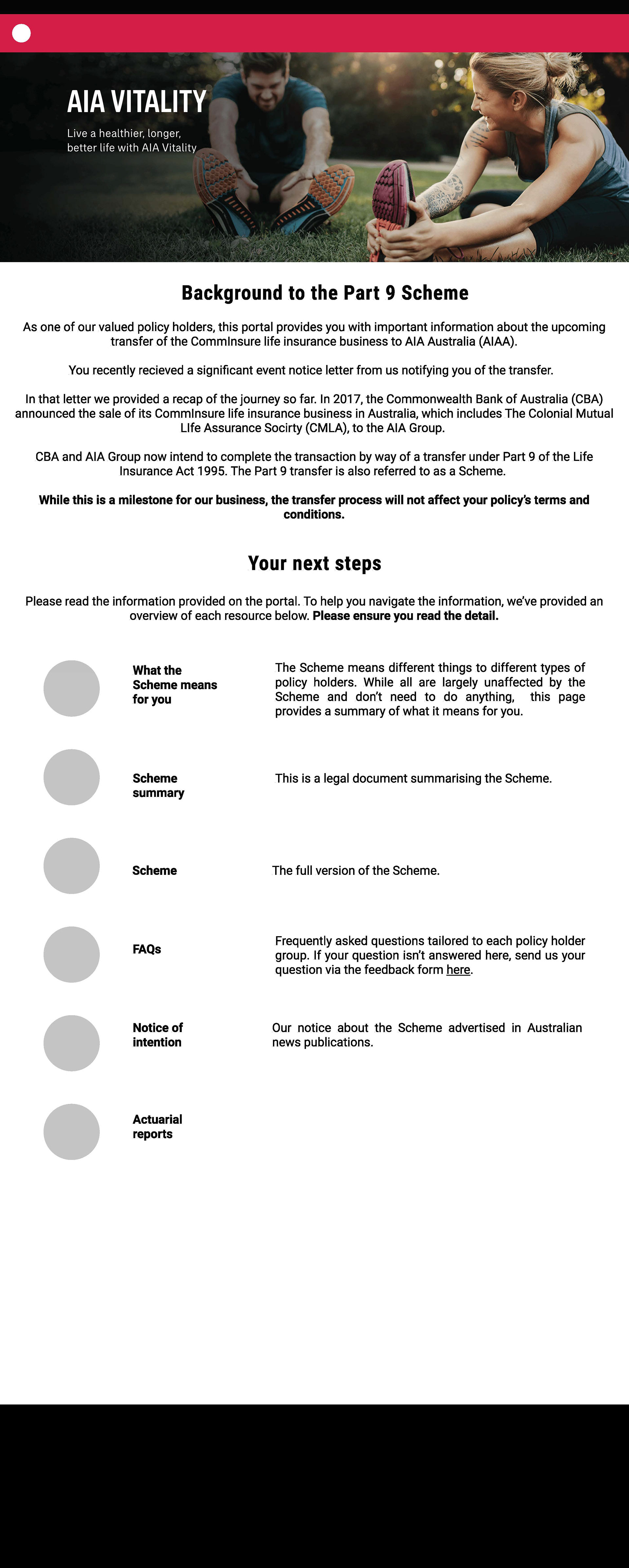
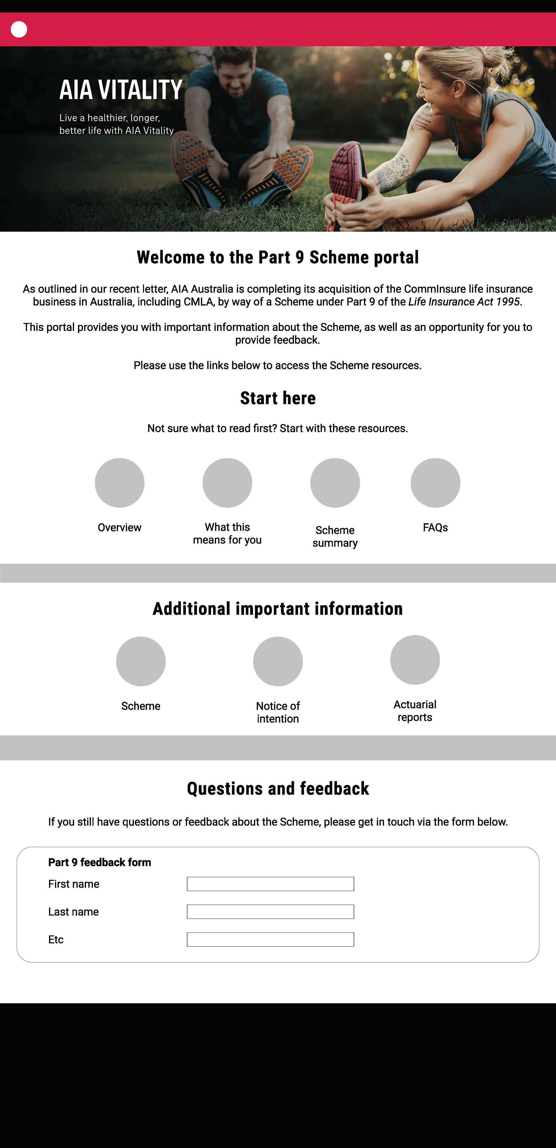
My role focused on managing the design and build of a customer-facing website that would explain the transfer and provide access to transfer documents, aka the 'Part 9 website.'
A key constraint in this project was the strict legal requirement and court-mandated process. All aspects of the site's design would need approval from legal and senior stakeholders in a rigorous "due diligence" process.
First steps: content audit and project management
After meeting with the project communications stream lead and members of the digital / UX team, I started with a content audit, followed by a proposed information architecture and list of site deliverables based on the BRD.
For the content audit, I built a list of existing content that was ready, content that I needed to create from scratch, and content that existed somewhere that we had to locate and would require some editing.
From here, I started drafting and locating content.
Basic mockups in Figma
Practicing my design skills in Figma, I pulled together basic wireframes using content and elements from AIA's existing website.


I added the early draft content directly into the Figma file so I knew how much space was available for copy from the outset.
While these basic wireframes were a guide, the digital team were able to use this alongside the information architecture (below) to draft high fidelity mockups.
Alongside the myriad other components of the communication project, I continued to work with the digital team to refine the content to ensure the language reflected the tone of voice of the rest of the AIA Australia website.
Research and iteration
We knew it would be important to test the draft content. Due to the uncertain outcome of the transfer at the time, the project was strictly confidential, so we couldn't test with real customers.
Instead the digital team organised edge-case interviews with internal team members familiar with our customers and products as a way to validate design, navigation and content, and to support our customer advocacy efforts with other stakeholders. I was able to listen in on some of these interviews to gather feedback first hand and iterate the draft content.
The slide below is from the research deck delivered by the Digital team summarising the findings.
Research findings: reducing jargon, improving consistency and flow
The research revealed that we had started to use language familiar to the project team and those familiar with the transfer, but which made no sense to anyone else.
We also had to reduce some of the technical legal jargon that had previously been requested by legal, for example replacing 'Part 9' with 'the transfer.'
Customer advocacy vs legal requirements
After implementing the findings from the research, while the content made more sense from a customer perspective, legal were yet to review the site. When they did, they pushed back on all our changes.
It became clear that the legal team were focused on satisfying the legal requirements, but did not consider how potentially alienating the legalese would be for customers.
The Digital team's research provided valuable evidence to support the project team's view that balancing customer needs with the legal language would serve the business' commercial objectives. Potentially alienating customers could cost the business valuable revenue and reputational damage.
Alongside the project communications lead we reached a compromise with legal whereby the majority of customer-centric language was retained.
Testing and refinement
Achieving compromise on the language and convincing stakeholders of the importance of customer-centric content was the main hurdle.
From here I continued to iterate the copy in the test environment with the digital team, crafting success state / form submission pages, addressing issues with the form submission and ensuring that submissions on the contact us form worked correctly in the back end.
Multiple exhaustive user acceptance testing (UAT) revealed some issues with the contact form, however from here on the design requirements were lesser; it was more about finalising the Part 9 website from a business requirements perspective.
Project management of outstanding items
One of the less exciting components of the design process is straightforward project management of outstanding feedback from testing. Using time-boxing and a status list (below), I worked with the wonderful Digital team to track and finalise the many, many final pieces of work that would ensure we were ready for launch in January 2021.
The launch of the Part 9 website was a success and a significant component in communicating this complex change to CommInsure and AIA's customers.

